| Essay title: | Peter Shire, Working-Class Elegance | |
| Author: | Anna Katz, Wendy Stark Curatorial Fellow | |
| Exhibition: | Peter Shire: Naked Is the Best Disguise | |
| Month and year: | April 2017 |
In a 2007 interview, Peter Shire remarked that the answer to the perennial question “Are you an artist, a craftsperson, or a designer?” depends on which discipline the asker is predisposed against, such that if one dislikes design, and dislikes Shire’s work, then Shire will be counted as a designer, and so on.¹ This crack is instructive. First, it nods to the idiosyncrasies of Shire’s prodigious Los Angeles–based career. Having studied ceramics under Ralph Bacerra and Adrian Saxe at the Chouinard Art Institute, where he earned a BFA in 1970, Shire set out to become a potter. Already by 1981, he began designing furniture, when—at the invitation of Ettore Sottsass, who spotted Shire’s ceramic teapots in a 1977 issue of the new-wave bible WET magazine—he became a founding member of the quintessentially postmodernist, Milan-based design collective Memphis. And he has since worked in glass and metal and expanded to large-scale outdoor public sculpture.²
Clay, however, remains Shire’s most tried and true medium (the love of his life, he has professed); and through clay, Shire has sustained a decades-long manipulation of the categories of art and craft, meaning that the impossibility of his classification as either artist, craftsperson, or designer is not only apposite, but intentional. This is the second lesson of the introductory quotation. Take Scorpion Pan Pipe (1983), an early example of Shire’s signature form, the teapot. A handle of pink segmented wedges, flexed like a scorpion’s tail, adjoins a conical yellow body, the lid to which is topped with an oversized black donut knob; meanwhile, a tidy row of gray tubes recalling a panpipe perches precariously on the teal spout. Exuberant colors, absurd proportions, improbable angles, and outlandish appendages stretch and squeeze the requirements of utility. For centuries in art historical discourse, utility has stood as the irreducible quality of craft, and purposelessness as the precondition of art. First established in the early modern period, when craft was defined as technical knowledge and art as aesthetic or conceptual knowledge, this distinction was consecrated by the modernist imperative of the autonomy of art, about which philosopher Immanuel Kant produced the most indelible statements, to say nothing of critics Clement Greenberg and Theodor Adorno.³ Characterized by the artist as “referentially functional”⁴ and by one critic as a “condescending nod to function,”⁵ Shire’s hand built teapots, from Turtle Rebar (1981) to Can Opener, 01 (2016), bring ceramics to the brink of sculpture—that is, to the brink of art as such.
By the time Shire emerged from art school in the 1970s, clay’s sculptural turn had already been effected by the new California ceramicists. John Mason, Ken Price, and Peter Voulkos, among others, in the 1950s and 1960s, created a new category of art: fired-clay sculpture. They were credited with liberating the medium from the constraints of practical use, ennobling ceramics by setting it in dialogue with abstract expressionism, art informel, Gutai, and pop.⁶ Yet Shire remained—then as now—dedicated to the teapot as a vessel, and one conceived for daily, shared use, to boot.
Further, Shire’s artistic maturation in the 1970s coincided with the stirrings of Pattern and Decoration (familiarly known as P&D), an under-recognized movement concentrated on both west and east coasts that enjoyed a prominent reception from about 1975 to 1985. P&D saw artists (Valerie Jaudon, Joyce Kozloff, Robert Kushner, Kim MacConnel, and Miriam Schapiro, to name a few) culling materials, compositional techniques, and surface patterns from the decorative and folk arts traditions, renegotiating received terms according to feminist values. Both Shire and P&D figures abnegated modernist purity and minimalist austerity, elevated domestic handicrafts, and generally thrilled to all that had been denigrated as lowly (craft, the feminine, kitsch). But whereas the P&D embrace of wallpaper, Islamic architectural ornamentation, American quilts, Persian miniatures, Indian carpets, and domestic embroideries was a reclamation or corruption from within, for Shire, the teapot or table that flirts with sculpture is an affirmation of his trade.
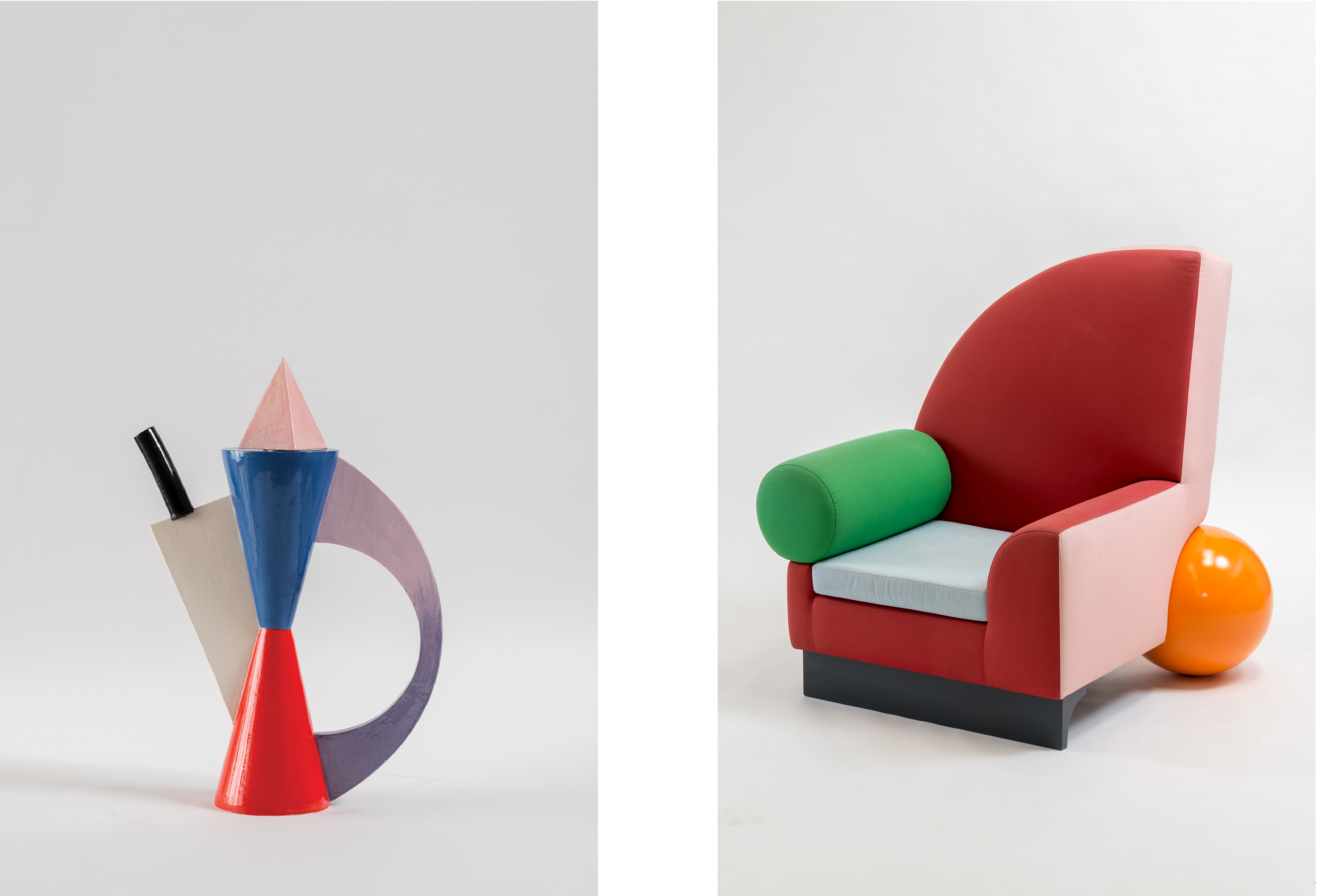
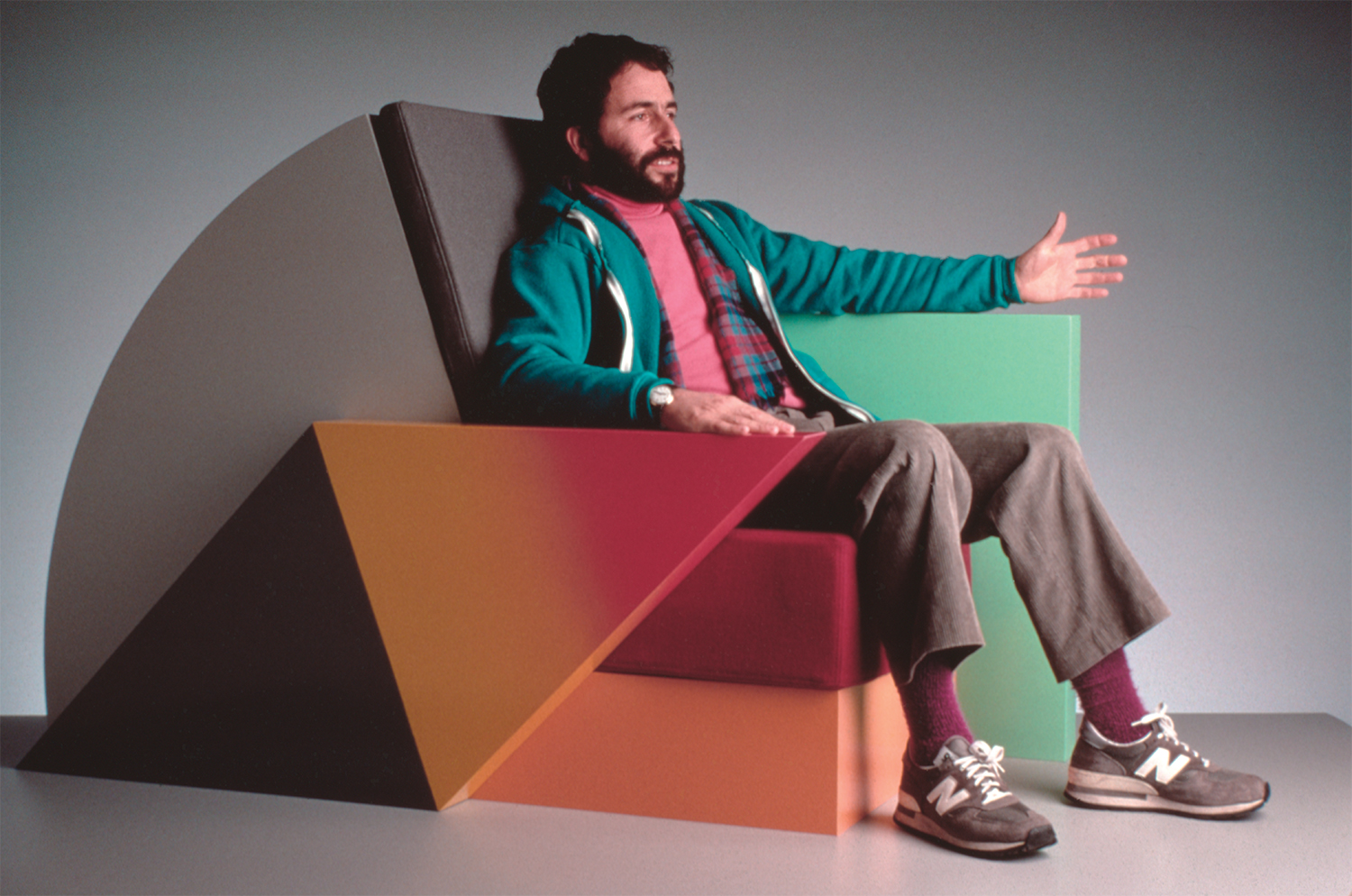
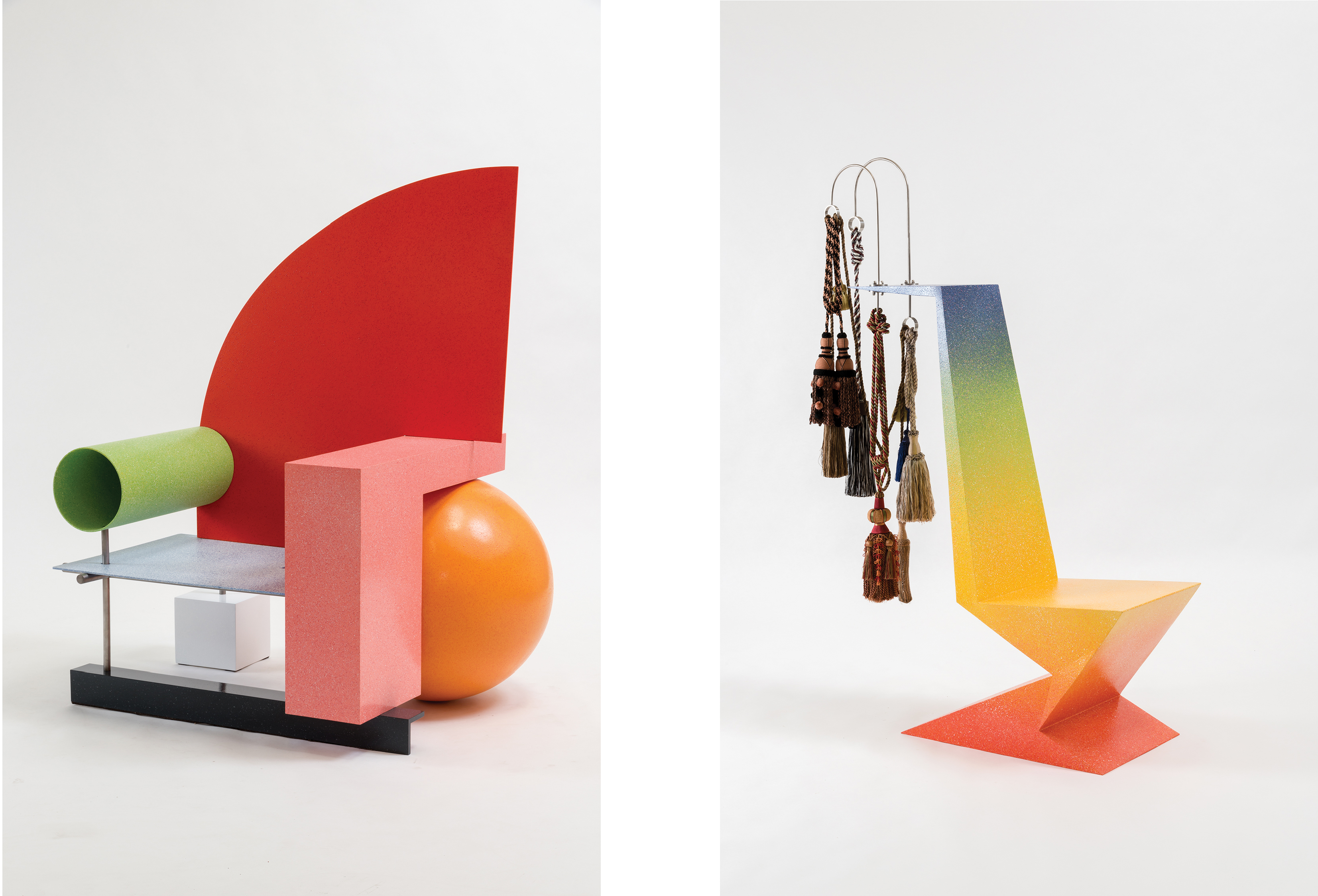
Indeed, if the California ceramicists and P&D artists claimed the fine arts/applied arts hierarchy as an error, then Shire preserves it as a site of social struggle. This is the third valence of Shire’s quip about his position as an artist, craftsperson, or designer: Shire traffics knowingly in the realm of likes and dislikes, that is, of taste. The provocation of Shire’s work is its headlong rush towards bad taste. Here, Shire’s Bel Air Chair (1981) is instructive. Exhibited in Memphis’s second annual collection, the chair quickly became an icon of the Memphis effort to inject levity into calcified, reductivist modernist designs, snipe at the dictum “form follows function,” and approach furniture as domestically scaled sculpture. With its Luis Barragán-via-Echo Park palette of peaches, lime greens, and pale blues, its outrageous Malibu beach ball “leg,” its asymmetrical shark fin back (based in part on John Lautner’s 1968 Stevens House), and its hot-rodding-cum-Googie architecture curves, the chair plays with the cone, the cube, the sphere, and the cylinder with the same irreverence that it toys with the taboos of fine art, from ornament to commercial colors and “low” culture predilections. Obstreperous, flippant, and, perhaps most grievous of all, excessive, Bel Air Chair and the versions that followed, Belle Aire Chair (2010) and Brentwood Chair (2017), tell a story about how liking and disliking, desiring and being repelled by, are late 20th-century exercises in defining a sense of one’s place, carried out even and especially by the objects of daily, domestic life.⁷
Shire’s work negotiates the values of art, craft, and industrial design with the home, not the museum, in mind. So it was for the early-20th century European avant-gardes. Projecting a new citizen-consumer, they tasked the applied arts with meeting the utopian call to integrate art and life. It’s why in a 1920 photo of the UNOVIS group (Utverditeli novogo iskusstva, the affirmers of the new art) setting off by train to a conference of teachers and art students in Moscow, Russian suprematist Kazimir Malevich clutches a porcelain plate in one hand and makes a clenched-fist salute with the other. It’s why Bauhaus architect Marcel Breuer’s fluid, logical, and minimal “Wassily” club chair (1925) capitalizes on the flexibility, light weight, strength, and mass producibility of tubular steel, as well as easy-to-clean leather or canvas seat, back, and armrests, all the better to allow the free unfolding of modern life. It’s why de Stijl designer Gerrit Rietveld’s Red Blue Chair (c. 1923) aims for simplicity in construction, utilizing wood in standard, readily available lumber sizes.
But Shire does not mistake function for utility: “A chair is a symbol of economic stature that goes back to when kings sat on thrones and common folk sat on the ground.”⁸ Thus, when Shire takes on Rietveld with his Right Weld Chair (2007), he pays homage to the mandate of planarity (it refers to Rietveld’s armless, legless, cantilevered seat Zig-Zag Chair [1934]) and to the emphasis on primary colors. Then he throws in more, too much, actually: a gradient spatter-painted finish evoking auto body styling and luxurious, if gaudy, ornamental tassels dangling from utterly inexplicable swimming pool handrails. By way of distortion, extravagance, superfluity, and exaggeration, Shire crystallizes the fantasies of the consumer and the purpose of the object in buttressing those fantasies for ourselves and towards others.⁹
Shire’s work reckons with the acknowledgment that craft and design’s integration of art and life concerns not only the means of production—durability, affordability, and practicality, as prioritized by his constructivist, Bauhaus, and de Stijl forebears—but also the “ends” of reception. Art and cultural consumption are tied to a social function of legitimating social differences, so argues Pierre Bourdieu in his landmark 1979 text Distinction.¹⁰ And taste, in the Bourdieuan sense, operates as a marker of class (the chestnut goes: “taste classifies, and it classifies the classifier”¹¹). Shire’s work confronts our cultural knowledge and tastes—our snobberies, our ways of making aesthetic choices in opposition to those made by other social classes in order to distinguish ourselves. He assaults us with bad taste—what is tacky, what is trendy, what is vulgar—and asks us to witness ourselves mastering those temptations. Of the humor and whimsy in his work, Shire has commented that what is funny is often what is insulting.¹² Insulting to our tastes, I take this to mean. Insulting because it betrays our pretensions, and thus our social positions.
The “excess” in Shire’s work—all that exceeds the stringency of utility—is the realm of the social. Playing out the social in the theater of our domestic lives and through the vocabulary of taste is of no less import and function than the relationship of an armrest to its support or than the pot’s ability to pour water from the bottom and not drip. Here is something else we recognize of ourselves in the remarkably anthropomorphic forms of Shire’s furniture and ceramics: sofas puff up their chests, tables cock their hips, teapots strut. Like us, they take stances and they display themselves. A teetering arrangement is striking a pose; a postmodernist pastiche of styles is a self-aware performance. If these positions are sometimes crude, it is because by skirting fine art, they—and we—are free to be unrefined; it is because this is the social position of the “mass,” of the working class.
1 Oral history interview with Peter Shire, Sept. 18–19, 2007, Archives of American Art, Smithsonian Institution.
2 Since his commission for the 1984 Los Angeles Olympics, Shire has completed more than two dozen public art commissions in the Greater Los Angeles area, Phoenix, Arizona, Las Vegas, Nevada, and Hokkaido, Japan. For locations of selected public artworks by Shire in Los Angeles, see the map featured in this brochure.
3 Craft has also been distinguished from art on the basis of material (e.g., clay, wood, and fiber); application (craft is associated with surface decoration); and modality (i.e., craft’s appeal to the haptic versus fine art’s optic or cognitive appeals). Going by other names—the primitive, ornament, the grotesque—these criteria have also served as alibi for the art-institutionalization of racist and sexist values.
4 Jo Lauria, “Flash-Points in the Life and Career of Artist Peter Shire,” in L.A. to LA: Peter Shire at LSU, January 21–April 14, 2013 (Baton Rouge: Louisiana State University Press, 2013), 6.
5 See Patricia Leigh Brown, “Currents; Teapots as Meditations on Free-Form Freeways,” The New York Times (Aug. 4, 1988), accessed Feb. 10, 2017, http://www.nytimes.com/1988/08/04/garden/currents-teapots-as-meditations-on-free-form-freeways.html.
6 This is Mary Davis MacNaughton’s considered argument in “Unexpected Connections: Clay Sculpture in LA and the Avant-Garde,” in Clay’s Tectonic Shift: John Mason, Ken Price, Peter Voulkos, 1956–1968, exh. cat., ed. MacNaughton (Claremont, CA: Ruth Chandler Williamson Gallery, Scripps College, with J. Paul Getty Museum, 2012).
7 Shire’s Brentwood Chair (2017) was specially commissioned by MOCA for Peter Shire: Naked Is the Best Disguise.
8 Shire as quoted in David A. Keeps, “Power of the Palette,” Los Angeles Times (Nov. 8, 2007), accessed Feb. 10, 2017, http://articles.latimes.com/2007/nov/08/home/hm-shire8.
9 In a remarkable 1991 essay, Norman M. Klein imagines Shire’s teapots as “invaded artworks, standing in for the invasion of private life.” In Klein’s telling, markets are like armies, fighting for recognition on the surface of a ceramic object, and the battle takes place in “the private world of the consumer—the home, household objects, knickknacks, crossover art/design items.” See Klein, “Tempest in a Teapot: The Social History of Peter Shire’s Ceramics,” in Tempest in a Teapot: The Ceramic Art of Peter Shire (New York: Rizzoli, 1991), 32.
10 Pierre Bourdieu, Distinction: A Social Critique of the Judgment of Taste, trans. Richard Nice (1979; Cambridge, MA: Harvard University Press, 1984).
11 Ibid., 6.
12 Conversation with the author, October 2016.